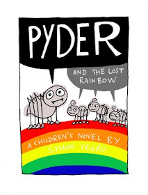
I'm here with a Pyder update.
I've done four ROUGH cover illustrations for Symon, the author, to choose from.
It'd be brillzor to get YOUR feedback too though, so let me know which one you prefer!
You can either comment on this blog post or tweet me.


I like number one. Try having the smaller title text in rainbow colours maybe? I think that might distract from its simplicity though, but it's worth a try =)
ReplyDelete1 and 3 are my faves, then 2, then 4.
ReplyDelete:) xxx